A prospective patient lands on your service page looking for one simple answer: “Can you help me, what will happen, and how do I book?” Instead, they find a large banner, several competing buttons, vague service names, a long paragraph, and a menu that sends them in three directions. They leave, not because the business is wrong for them, but because the page asks for more patience than they have.
That pattern appears on dental, eye-care, medspa, legal, and small-business websites every day. The design may look modern, yet the information behaves like a box of unsorted papers. Website content structure fixes the deeper problem by giving every answer, link, heading, and action a clear place. It helps people move with confidence, and it gives search systems a more reliable account of what each page means.
Table of Contents
- Why Structure Matters Before Anything Else
- The Anatomy of a Well-Structured Page
- What Real Pages Look Like in the Wild
- Mapping Content to Real Visitor Journeys
- Connecting Pages With Intentional Internal Links
- Structure as Performance and Accessibility
- Templates and a Pre-Launch Checklist for Key Pages
Why Structure Matters Before Anything Else
Most website rebuilds begin with a visual complaint. The colours feel dated, the homepage looks crowded, or a competitor appears more polished. Those observations may be valid, but a new visual layer won't solve a visitor's basic frustration if the underlying information remains difficult to find.
Consider a dental practice page for same-day crowns. The visitor wants to know whether the treatment is suitable, what the appointment involves, whether financing or insurance information is available, and how to request an appointment. If those answers are scattered between a hero banner, a paragraph about the practice, a testimonial carousel, and an unexplained button labelled “Learn More,” the visitor must assemble the journey alone.
Practical rule: If a visitor has to interpret your page before they can use it, the structure is doing too little work.
Structure is the connective tissue between design, search visibility, and conversion. A clear title establishes the page topic. Headings divide the explanation into useful stops. Internal links show where related information lives. A descriptive call to action tells the visitor what happens next. None of these choices depends on decorative styling, although good design can make the hierarchy easier to see.
The patience problem matters because people arrive with limited attention and a specific task. They may be comparing providers on a phone, checking whether a law firm handles their situation, or trying to find a local optometrist before work. A page that makes them hunt for basic information spends that attention too quickly.
Search engines face a related challenge. They need to understand whether a page describes a service, a location, a practitioner, a policy, or a general question. Meaningful elements such as headings, paragraphs, links, images, navigation, and footers provide that context. The historical development of HTML established this separation between content meaning and visual presentation, a foundation that still supports maintainability, accessibility, and more interpretable indexing (HTML's structural history and semantic model).
A redesign can make a confused page prettier. A considered structure makes it easier to use, maintain, crawl, and trust. That's why structure deserves attention before the next colour palette or animation.
The Anatomy of a Well-Structured Page
A useful page resembles a well-signposted building. The title tells you which building you've entered, the main heading names the destination, section headings point to different rooms, and links guide you to connected places. Visitors shouldn't need to inspect the architecture to understand where they are.
Start with the page promise
The title tag and meta description help present the page in search results. They should describe the page accurately and make its purpose clear. Once the visitor arrives, the H1 should state the primary topic in plain language, such as “Emergency Dental Care in Bristol” or “Laser Skin Treatments in Austin.”
A page should normally have one perceivable primary heading. That doesn't mean every large piece of text needs to become a heading. A slogan may be visually prominent while remaining supporting copy, and CSS should control appearance rather than heading levels.
Build a readable hierarchy
Use H2 headings for the main questions or sections a visitor needs to find. A service page might use “Who Is This Treatment For,” “What Happens During Your Visit,” “Fees and Insurance,” “Common Questions,” and “Book a Consultation.” Use H3 headings beneath those sections when you need to divide a topic further.
Heading order communicates relationships. A heading should describe the content that follows, not exist merely because its font size looks attractive. The W3C guidance on semantic HTML and accessible headings explains why programmatic relationships matter to people using screen readers, while semantic HTML explained for Vue teams offers a practical developer-facing explanation.
Give every element a job
Body paragraphs provide explanation and nuance. Lists make steps, requirements, or included services easy to scan. Images should add useful context and include meaningful alternative text rather than a filename. Internal links connect the page to related services, locations, practitioner biographies, FAQs, and contact options.
Calls to action should describe the next step. “Request an eye examination” tells a visitor more than “Click here.” A form label such as “Preferred appointment date” is more useful than a vague field label such as “Details.”
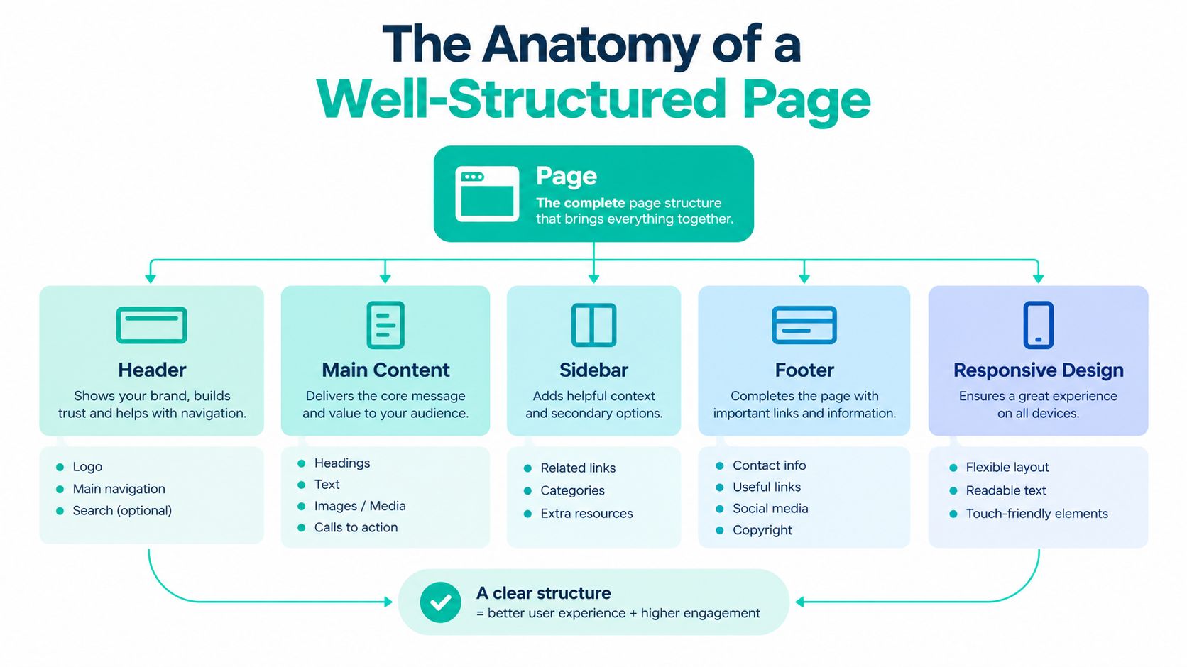
On a phone, these parts should still read in a logical order. The primary answer shouldn't sit below decorative content, and a booking control shouldn't disappear beneath unrelated promotions. Semantic HTML separates meaning from appearance, so the same content can work across browsers, devices, assistive technologies, and different visual treatments.
The best test is simple. Ask someone unfamiliar with the business to find the service, understand the process, locate practical details, and reach the next step. If they pause repeatedly, the page needs clearer signposts, not necessarily more copy.
What Real Pages Look Like in the Wild
A page can look polished and still make visitors work too hard. Historical evidence helps show what structurally mature pages tend to include. The HTTP Archive's 2020 mobile dataset, one of the largest snapshots of its kind, examined approximately 6.3 million pages and recorded how frequently different markup elements appeared across the Web (HTTP Archive markup data). Because the snapshot is from 2020, treat these figures as context, not a current picture of every typical page.
| Structural Elements Found on Typical Mobile Web Pages | Share of Pages |
|---|---|
| Title element | 99.34% |
| Meta elements | 99.00% |
| Links | 98.32% |
| Images | 95.83% |
| Paragraphs | 88.71% |
| Unordered lists | 87.68% |
The pattern matters more than any individual figure. Strong pages usually combine titles, links, images, paragraphs, and lists so visitors can locate an answer without waiting for every detail to reveal itself.
The same historical snapshot recorded average counts of 1.66 H1 headings, 5.88 H2 headings, and 6.96 H3 headings, followed by 3.23 H4, 1.36 H5, and 0.56 H6 headings. These averages describe observed pages, not instructions for building a template. A short contact page may need one clear section, while a detailed treatment page may need several layers of explanation.
For a local service business, use those observations to ask practical questions:
- Title and metadata: Does the title identify the service and relevant location or intent?
- Primary topic: Can a visitor understand the page's main purpose from the H1 and opening copy?
- Section hierarchy: Do H2 and H3 headings follow real visitor questions?
- Supporting media: Do images explain the service, environment, people, or process?
- Navigation and links: Can visitors reach related services, FAQs, team information, and booking?
- Scanning aids: Are lists used for comparisons, preparation details, or step-by-step guidance?
A page may contain every item in the table and still feel chaotic. Relationships create clarity. A relevant link beside an explanation helps more than the same destination buried in a crowded footer. A heading such as “What to Expect at Your First Appointment” gives patience a purpose, while a repeated slogan asks readers to keep searching.
Use the benchmarks as a discussion prompt, not a scorecard. The Leaping Lemur Media journal offers further reading on related website strategy topics.
Mapping Content to Real Visitor Journeys
A website's taxonomy should follow the questions people ask, not the internal departments of the business. Visitors don't think, “I need to inspect your service-category architecture.” They think, “My tooth hurts,” “I want smoother skin,” or “Can this firm handle my dispute?”
Start with the homepage as a clear orientation point. It should explain who the business serves, what it offers, where it operates, and which actions deserve priority. From there, group information into understandable destinations.
Use a dental practice as the model
A dental website might organize its primary information like this:
- Home: A concise overview of care, location, trust signals, and booking.
- Services: A category page that introduces major treatment groups.
- Individual services: Pages for implants, emergency care, hygiene, crowns, or cosmetic treatments.
- Patient resources: Information about fees, insurance, preparation, aftercare, and frequently asked questions.
- About and team: Practitioner qualifications, approach, facilities, and community context.
- Contact and booking: Address, opening information, contact methods, and appointment action.
A medspa may use a similar pattern with treatment categories, individual treatment pages, consultation information, practitioner profiles, aftercare, and location details. The medspa marketing resource from Leaping Lemur Media can sit within that broader planning conversation, but the structural principle remains the same: each page should answer a distinct need.
Don't put every destination in the main menu. The menu should expose the routes visitors use most often, while contextual links can handle supporting information. A treatment page can link to the practitioner who performs it, the location where it's available, an eligibility FAQ, and the consultation page without turning the navigation into a catalogue.
Spot misplaced content
A page is probably in the wrong bucket when its title serves the business rather than the visitor. “Solutions” may sound polished, but “Business Litigation Services” tells a law-firm visitor what they can find. “Our Expertise” may need to become separate service pages if people need to compare distinct options.
Be careful when mixing audiences. A page for existing patients shouldn't carry the same structure as a page for someone researching a first appointment. A practitioner biography can reassure a reader, but it shouldn't force that reader to search through personal history for treatment details.
An HTML sitemap can provide another navigational layer for people and crawlers. The overview of HTML sitemap SEO benefits is useful when deciding how a larger collection of pages should remain discoverable without overloading the main menu.
Sketch the journey on paper before changing the design. Write the visitor's question at the top of each page, then draw the most helpful next step. If one page tries to answer five unrelated questions, split its purpose or create clearer sections.
Connecting Pages With Intentional Internal Links
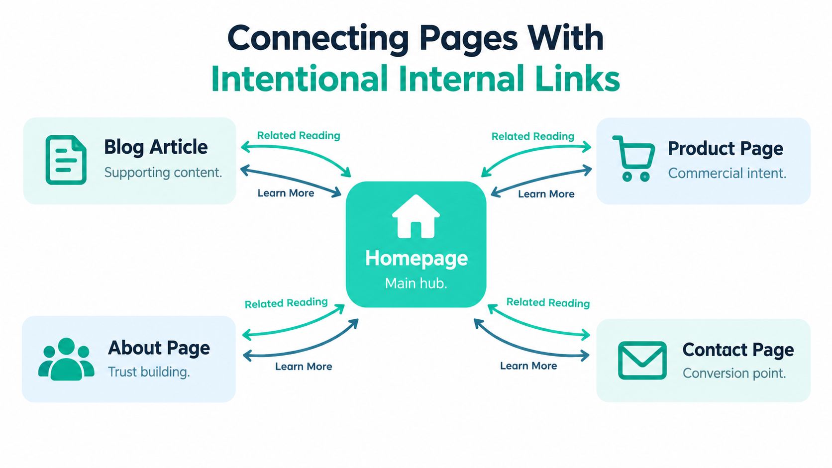
A website becomes easier to understand when its pages explain their relationships. Without internal links, a service page, location page, practitioner profile, and FAQ may all exist, but they behave like separate pamphlets in different rooms.
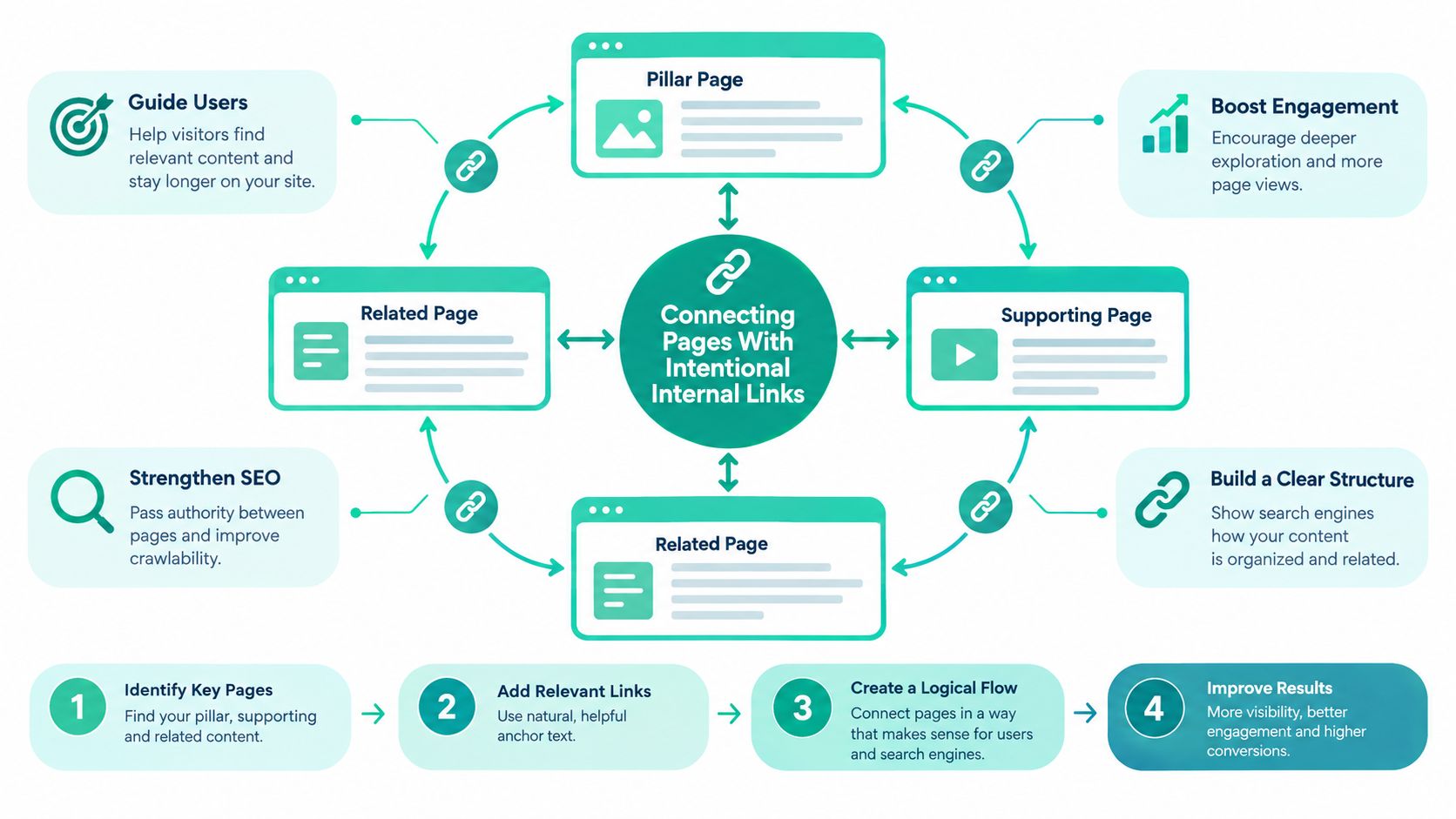
Google Search Central recommends logical organization, descriptive headings, and internal links that connect important pages. Its guidance also explains that systems often discover pages through links from pages already crawled, which makes crawlable linking a structural mechanic rather than a decoration (Google's SEO Starter Guide).
Link from context, not from panic
Suppose a dental practice has a page about dental implants. A useful page relationship might look like this:
- The implant page explains the treatment and links to “meet our implant dentist.”
- The same page links to a relevant fees and financing section.
- A location page links to the implant page with descriptive language.
- An FAQ answers preparation and recovery questions.
- Each page offers a clear route to request a consultation.
The anchor text should tell visitors what they'll find. “Read more” wastes the opportunity to clarify the destination. “Learn about implant consultation appointments” gives people and search systems a stronger signal.
Place links where the reader needs them. Navigation supports broad movement. Body links support a specific decision. Related-content blocks help visitors continue after they finish a section. Footer links can provide useful completeness, but they shouldn't carry the entire discovery burden.
Prevent orphan pages
An orphan page has no meaningful internal route leading to it. It may still be accessible through search, a campaign, or a direct URL, but visitors who enter elsewhere won't find it naturally.
Review each important page and ask:
- Entry point: Which page introduces this topic?
- Relationship: Which related pages should link to it?
- Next action: Where should a visitor go after reading it?
- Language: Do headings and anchor text use consistent terms?
- Maintenance: Who will update links when services or locations change?
Avoid forcing every page to link to every other page. Excessive linking creates visual noise and weakens the meaning of each connection. A link should answer a likely next question, not prove that someone completed an internal-linking checklist.
Internal linking also protects against a common content problem: repeated explanations scattered across near-identical pages. Keep the authoritative explanation in the page that owns the topic, then link to it from supporting pages. A location page can summarize a service and point to the main service page for process details. That arrangement gives visitors a shorter local route while preserving one clear source for the deeper explanation.
The result is a topic map. People can move from general information to a specific service, from service to practitioner, and from reassurance to booking. Search systems receive the same relationships through crawlable, descriptive connections.
Structure as Performance and Accessibility
A page can answer the right question and still frustrate visitors if its layout shifts while they read. Someone reaches for a phone number, form, or booking button, and a late-loading banner moves it out of reach. Structure therefore affects comprehension, task completion, and the experience of people using assistive technology.
A large analysis of 208,000 webpages found that large layout shifts contributed heavily to poor Cumulative Layout Shift scores. 94.5% of pages experienced large layout shifts, while render-blocking resources affected 86.3% (Core Web Vitals layout-shift analysis). CLS measures unexpected movement. The cited Search Console benchmark treats CLS below 0.1 as good.
Reserve the space people rely on
A browser cannot reserve the right amount of room for an image whose dimensions are unknown. Consent notices, promotional bars, embedded tools, and web fonts can create the same problem when they change the page after the first render. Visitors should not have to wait patiently for the interface to settle before they can act.
Practical structural choices include:
- Set image dimensions: Reserve space for images and embeds before they load.
- Control announcements: Place nonessential notices outside the main content flow, or allocate their space in advance.
- Prioritize assets: Preload only assets needed for the first view.
- Protect actions: Keep phone buttons, forms, and booking controls stable and visible.
Accessibility depends on the same deliberate structure. The 2025 Web Almanac identifies colour contrast, link naming, heading hierarchy, and alternative text as persistent website problems. A separate analysis of 10,000 websites reported that more than 70% failed to comply with current accessibility guidelines, while higher accessibility-compliance scores correlated with 23% more organic traffic and 27% more ranking keywords (Web Almanac accessibility findings).
Taken together, these findings suggest that accessibility work and structural clarity reinforce each other. Descriptive headings, meaningful link labels, labelled forms, useful alt text, and keyboard-friendly sequences help assistive technology users and give search systems clearer signals about the page. Accessibility is part of the architecture, not an audit added after the copy is finished. It asks whether someone who does not rely on sight, a mouse, or familiarity with the business can still understand the page and complete its task.

Templates and a Pre-Launch Checklist for Key Pages
A reusable template keeps every page from becoming a fresh argument. It also prevents teams from adding sections only because a competitor has them.
| Matching Page Templates to Visitor Goals | Primary Goal | Must-Have Structural Elements |
|---|---|---|
| Homepage | Orient and direct | Clear value proposition, priority services, location, trust information, primary CTA |
| Service page | Educate and convert | Descriptive H1, benefits, process, suitability, practical details, related links, booking CTA |
| Location page | Reassure local visitors | Location-specific introduction, services available, access information, practitioner or team link, contact action |
| Practitioner page | Build trust | Role, qualifications, approach, services provided, relevant booking route |
| FAQ page | Remove uncertainty | Question-based headings, concise answers, links to deeper explanations |
| Contact page | Enable action | Address, contact methods, opening information, labelled form, clear confirmation path |
Before launch, check the page in the order a visitor experiences it:
- Purpose: Does the title, H1, and opening copy agree about the page topic?
- Hierarchy: Do H2 and H3 headings describe the sections beneath them?
- Answer order: Does the page answer the most urgent visitor questions early?
- Navigation: Can a visitor reach related services, location details, trust information, and contact options?
- Links: Do anchor labels describe their destinations, and are important pages free from orphan status?
- Media: Do images have useful alt text and reserved dimensions?
- Interaction: Can someone use the form, menu, buttons, and accordions with a keyboard?
- Stability: Do banners, fonts, images, and embeds avoid moving the main content?
- Metadata: Does the title and description accurately represent the page?
If the site needs strategic planning, copy, design, development, or SEO foundations together, Leaping Lemur Media's website services describe the kinds of work that can support this system.
Structure won't make every visitor convert, and it won't replace a credible service. It does remove avoidable hesitation. When each page has a clear job and each link supports a real decision, design has a stronger foundation to express the business rather than compensate for confusion.
Leaping Lemur Media helps practices and small businesses plan, build, and refine websites with clearer page hierarchy, navigation, conversion paths, and SEO foundations. Visit Leaping Lemur Media to discuss a website structure that helps the right patients or clients find answers and take the next step.