
Patients experience a practice's brand before they speak with a provider. In one quantitative study of 300 participants, 84% said visually appealing interior elements improved their perception of brand quality. The study's published findings make a practical point for dentists, eye doctors, medspa owners, and other practice leaders: the environment isn't background decoration. It participates in the trust decision.
Good interior branding design turns that first impression into a usable patient journey. The strongest examples work across four lenses: what the patient notices, what strategic message the choice sends, what trade-off it creates, and how another practice can adapt the tactic without copying the original look. A calm waiting room can still create confusion if the signs are poor. A beautiful reception desk can still feel unwelcoming if staff can't see arrivals.
The eight touchpoints below connect confidence, comfort, clarity, and care to daily operations. Each one is a replicable tactic, not just a visual idea to save to a mood board.
The strategic test: If a design choice looks impressive but makes patients hesitate, staff work harder, or maintenance slip, it isn't finished.
Table of Contents
- 1. Branded Wayfinding and Signage Systems
- 2. Custom Color Psychology and Interior Paint Schemes
- 3. Branded Reception Desk and Waiting Area Design
- 4. Branded Lighting Design and Fixtures
- 5. Custom Flooring and Material Palette Branding
- 6. Branded Wall Art, Graphics, and Mural Installation
- 7. Custom Furniture Selection and Brand-Appropriate Styling
- 8. Branded Amenity Stations and Functional Design Elements
- 8-Point Interior Branding Design Comparison
- Turn Inspiration Into a Branded Patient Journey
1. Branded Wayfinding and Signage Systems
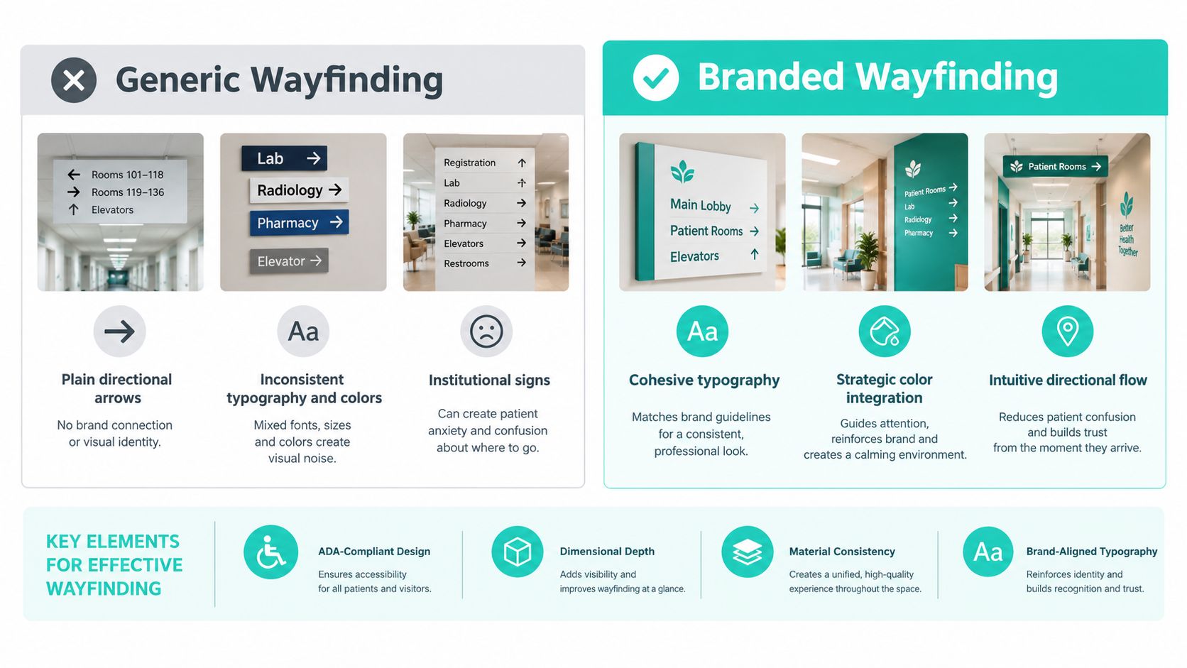
A patient who can't find reception, imaging, a treatment room, or the restroom may interpret that friction as a lack of care. Branded wayfinding gives the practice a chance to communicate calm competence before anyone offers verbal assistance. The patient notices typography, color, room names, directional arrows, and the sequence of information. Together, those details say whether the practice feels considered, clinical, warm, premium, or improvised.
A luxury dental office might use custom wood and metal room identifiers, while a modern eye care clinic could integrate digital displays into its navigation system. A medspa may treat directional signage as part of the interior styling, using refined materials and restrained lettering rather than a collection of temporary notices. The tactic is transferable because the brand message lives in the system, not in a particular finish.
Environmental Graphic Design research on shopping-center wayfinding emphasizes practical mechanics such as placing signs at decision points, maintaining consistent graphic styles, and using digital displays to support circulation and engagement. Healthcare facilities also commonly combine directional, identification, and informational signs with Braille and room signs, while keeping materials, colors, and finishes consistent for accessibility and brand unity, as outlined in this ADA interior wayfinding guidance.
Build the route around decisions
Put the sign before the moment of uncertainty, not beside the doorway the patient has already passed. Use positive language that reflects the practice voice, and avoid a wall covered with competing instructions. Test the route with actual patients and staff, including people unfamiliar with the building.
Before production, document:
- Brand rules: Confirm typography, color, tone, icon style, and terminology.
- Operational ownership: Assign someone to replace damaged signs and update room names.
- Compliance review: Involve a designer familiar with healthcare accessibility requirements.
- Digital flexibility: Use screens or backlighting only where staff can maintain them reliably.
A practice investing in dental marketing strategy should connect its online language with the physical route. The same promise of clarity, warmth, or precision should appear in the welcome message, appointment instructions, signage, and staff handoff. Teams involved in design management in construction can also protect that consistency by recording signage specifications before installation.
2. Custom Color Psychology and Interior Paint Schemes
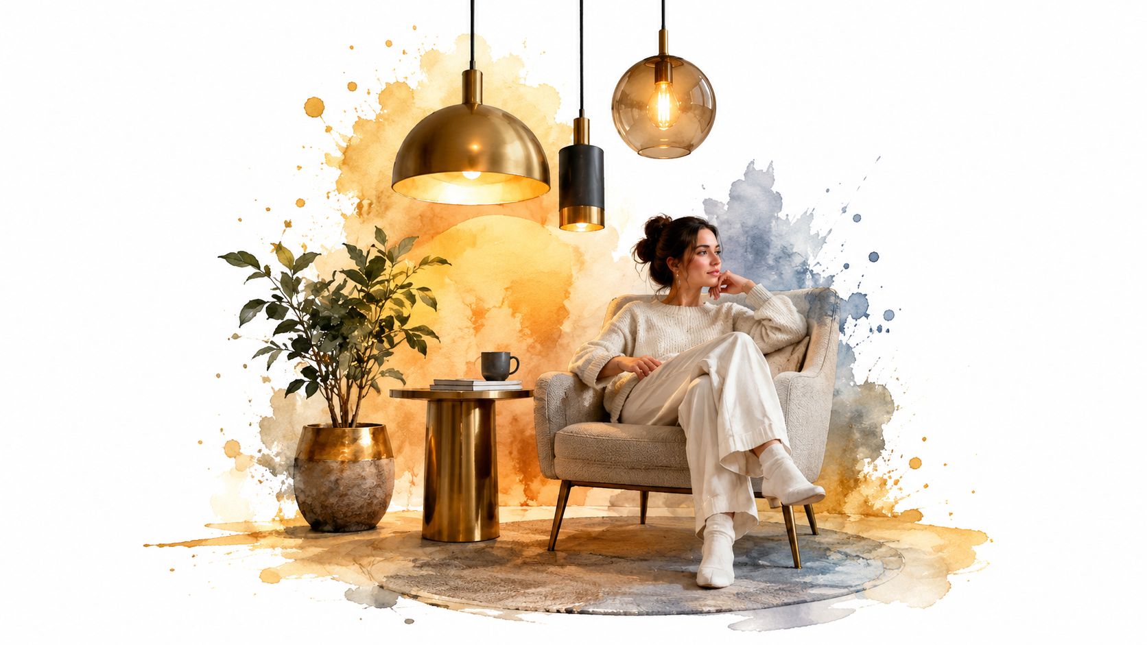
Color should help a patient understand what kind of care they're about to receive. Soft sage in a dental treatment room can support a calmer atmosphere. Warm taupe and restrained gold may suit a medspa positioned around luxury. Crisp navy and white can reinforce precision in an eye care clinic, while soft pastels and carefully placed brand-color accents can make a pediatric practice feel friendly without turning the space into a playroom.
The patient notices the emotional tone first, then the consistency. If the waiting room promises warmth but the hallway is stark and the treatment room uses unrelated colors, the brand feels fragmented. A clear palette creates recognition across zones while allowing each space to perform a different job. Main walls can remain quiet, accent walls can carry the primary brand color, and trim or furniture can provide secondary contrast.
A practice should adapt the principle to its patient population and actual lighting, rather than selecting colors from a screen. Test samples on different walls throughout the day. Artificial light, daylight, surface texture, and nearby materials can change how the same paint appears.
Use color as a hierarchy
A useful palette includes rules, not just swatches. Record paint codes, approved finishes, accent locations, and the colors reserved for navigation or clinical communication. Strong contrast can support visibility, but excessive contrast can make a small clinic feel busy.
The trade-off is between memorability and overstimulation. A full room in a saturated brand color may photograph well but create fatigue, particularly for anxious patients. A neutral space with one deliberate color cue can feel more confident and remain easier to update.
For medspa owners refining their positioning, medspa marketing services should carry the same color logic into photography, social content, printed materials, and the website. The physical space shouldn't be the only place where the audience sees the brand's emotional promise.
A color palette earns its place when it makes the practice easier to recognize and easier to feel comfortable in, not merely when it looks attractive in a rendering.
3. Branded Reception Desk and Waiting Area Design
The reception desk is where the patient journey becomes personal. A floating desk with a backlit logo may suit a high-end dental practice. Live-edge wood with restrained brand colors could support a modern medspa. A minimalist eye care clinic might use integrated ambient lighting and a clear sightline from the entrance. Each example communicates a different promise, but the operational requirement remains the same: staff should be able to greet patients quickly, and patients should know where to go.
The patient notices the desk, the wall behind it, the seating arrangement, the visible clutter, and whether the staff area appears organized. The strategic message may be premium care, approachable expertise, or efficient professionalism. The trade-off is that custom joinery and distinctive materials can raise cost and complicate repairs. A dramatic desk that blocks visibility or creates an awkward check-in exchange weakens the experience it was meant to improve.
Research on interior architectural branding found that store interiors can express brand personality at the point of sale and influence perceptions of brand values and attributes. The published research on interior architectural branding supports applying the same logic to practices. The reception environment communicates before the receptionist speaks.
Design the welcome and the work
Use durable, cleanable materials in high-touch areas. Set the desk at a height that accommodates diverse patients, including wheelchair users, and create a discreet location for private conversations. Keep credentials, testimonials, or the practice story visible but edited. A wall packed with awards can feel defensive, while one well-presented proof point can invite a useful conversation.
The waiting area also needs different seating types, comfortable circulation, and sightlines that help patients understand the next step. Practices seeking broader brand and growth support can review Leaping Lemur Media's services to connect the physical welcome with their positioning and patient-facing communications.
4. Branded Lighting Design and Fixtures
Lighting changes the meaning of every other material in the room. Warm, adjustable light in a dental waiting area can make the space feel more settled. An eye care clinic may need brighter clinical lighting for precision while keeping the reception zone warmer. A medspa can use restrained accent lighting to draw attention to its name, materials, or architectural detail without making the room feel theatrical.
Patients notice glare, shadows, harsh transitions, and whether faces are easy to read. Staff notice whether they can complete tasks safely and accurately. That creates a central trade-off: lighting must support patient comfort and clinical work at the same time. Decorative fixtures can reinforce the brand, but they shouldn't obstruct circulation, collect difficult-to-clean dust, or create reflections that interfere with equipment.
A practical specification might use warmer light in patient-facing areas and brighter light in consultation or clinical zones, but the correct choice depends on the room, task, surfaces, and clinical requirements. Avoid treating color temperature as a branding shortcut. Test the design at different times of day, especially where natural light changes the appearance of walls, floors, and skin tones.
Layer light instead of flooding the room
Combine ambient, task, and accent lighting. Use task lighting where staff need clarity, softer sources where patients wait, and carefully aimed accents for logos or signage. Dimmers can help a room shift between functions, provided staff know how to use them and the controls are easy to maintain.
A lighting designer should review glare, shadows, cleaning access, energy use, and maintenance alongside the visual concept. The same discipline applies to statement materials. If an onyx feature is part of the concept, review onyx marble texture and selection considerations before specifying it, because translucency and veining can look very different under direct and indirect light.
Lighting rule: Don't ask whether a fixture looks branded in isolation. Ask what it does to the patient's face, the staff's task, the sign's legibility, and the room's sense of calm.
5. Custom Flooring and Material Palette Branding
Patients may not name the floor, but they read what it suggests. Polished concrete can support an industrial, contemporary dental practice. Large-format tile can make an eye care clinic feel clean and precise. Hardwood can communicate tradition in a law office, while natural stone may support a premium medspa. Flooring becomes the visual foundation for the rest of the interior branding design.
Material choices also carry practical signals about cleanliness, value, and care. A premium surface can enhance perceived quality, but an expensive material that stains, echoes, or requires complex upkeep may frustrate staff. Economical materials aren't automatically wrong, yet a visibly worn or poorly coordinated floor can undermine a carefully designed reception area.
Coordinate performance with perception
Start with the patient route. Select materials that can tolerate traffic, support cleaning requirements, and meet the practice's healthcare standards. Review antimicrobial properties where relevant, but don't treat a product claim as a substitute for proper cleaning and maintenance procedures. Hard flooring can make a clinic sound more clinical, so acoustic treatment, rugs where appropriate, upholstered furniture, and ceiling materials may need to balance it.
Use one dependable material across primary patient areas when cohesion matters. Introduce variety through controlled transitions between zones rather than abrupt lines that confuse navigation. Grout color, sealer, sheen, edge details, and repair access belong in the brand specification, not in a contractor's last-minute decision.
A material palette should answer four questions:
- What does it communicate? Warmth, precision, luxury, stability, or innovation.
- How does it perform? Cleaning, slip resistance, durability, acoustics, and repairability.
- How does it age? Consider patina, fading, scratches, and replacement availability.
- Where does it stop? Define transitions so the route remains intuitive.
The best material scheme is quiet enough to support care but distinctive enough to make the practice feel intentional.
6. Branded Wall Art, Graphics, and Mural Installation
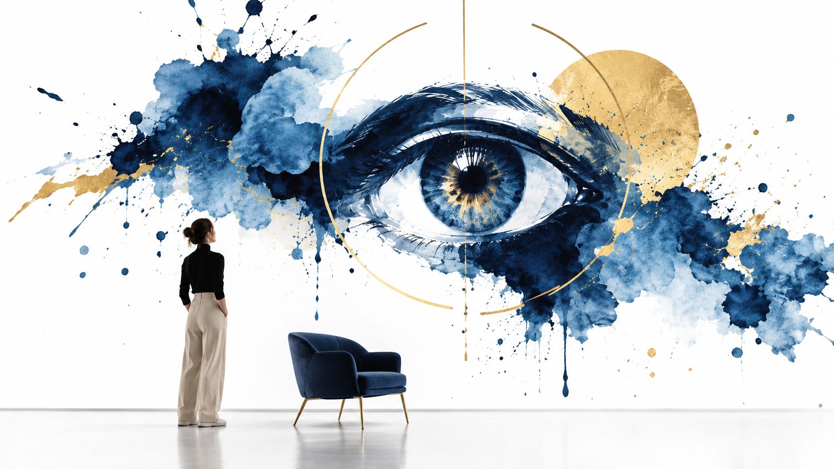
Blank walls are missed opportunities, but filling every surface with the logo creates a different problem. Branded art works when it gives patients something emotionally useful to notice while waiting, moving through the clinic, or preparing for treatment. An abstract mural about vision can suit an eye care practice. A medspa might use refined lifestyle imagery that reflects desired outcomes. A dental office can show transformation through carefully selected, relatable visuals rather than exaggerated perfection.
The patient notices scale, color, subject matter, and whether the art feels made for real people. The strategic message may be optimism, expertise, calm, community connection, or confidence. The trade-off is credibility. Amateur artwork, generic stock photography, or claims that feel too promotional can make the practice seem less trustworthy.
Tell a story without turning the wall into an advertisement
Place a focal mural where patients naturally pause, such as reception or the main waiting area. Use brand colors as a visual thread, but let the artist create a composition rather than forcing every element into a marketing layout. Patient stories and testimonials can become artful installations when the practice has permission, represents patients responsibly, and avoids implying guaranteed outcomes.
Mix aspirational imagery with familiar, inclusive representation. A patient should be able to see the practice's desired outcome without feeling that the space excludes people like them. Consider rotating smaller works or seasonal pieces, but only if someone owns the schedule, installation, and condition checks.
Professional documentation can extend the value of an original mural into social content, brochures, and the website. That reuse should preserve the artwork's context and the patient's privacy. A wall becomes a brand asset when it supports the experience in person and communicates consistently elsewhere.
The strongest clinic mural doesn't shout, “Look at our brand.” It gives the patient a calmer, clearer reason to stay engaged with the space.
7. Custom Furniture Selection and Brand-Appropriate Styling
Furniture tells patients how the practice expects them to feel. Designer lounge seating can give a medspa a resort-like character. Custom chairs and carefully finished tables can support stability in a law office. Sculptural pieces may help a contemporary dental practice feel distinctive, while healthcare-appropriate seating in an eye clinic must prioritize comfort, cleanability, and ease of movement.
The patient notices proportion, upholstery, spacing, and whether the furniture looks cared for. The strategic message might be hospitality, precision, confidence, or approachable expertise. The trade-off is that statement furniture often competes with the patient's practical needs. A chair that photographs beautifully but offers poor support, blocks a walkway, or cannot withstand cleaning is a branding liability.
Select for the whole route
Use fewer strong pieces rather than filling the room with mediocre furniture. Choose upholstery that handles cleaning and matches the practice's maintenance capabilities. Mix seating types, including chairs, sofas, and varied heights, so patients have options. Keep pathways clear and consider how a parent with a child, an older patient, or someone using mobility equipment moves through the space.
Scale matters more than many owners expect. Oversized furniture can make a waiting room feel crowded, while undersized pieces can make a premium practice feel temporary. Use statement items in high-visibility areas, then choose simpler, durable foundations elsewhere.
A small practice can combine one distinctive reception chair or side table with cost-conscious foundational seating. That approach protects the budget without making the room feel generic. Staff should inspect upholstery, legs, arms, and tables as part of routine maintenance. Worn fabric and unstable furniture communicate neglect faster than a practice may realize.
The most effective furniture plan supports the same emotional promise as the signage, color, and lighting. Comfort isn't separate from the brand. It's one of the clearest ways patients experience it.
8. Branded Amenity Stations and Functional Design Elements
A water station, coffee bar, restroom, reading area, or comfort shelf can reveal more about a practice than a decorative logo. Patients notice whether the station is clean, stocked, intuitive, and aligned with the type of care being offered. A luxury medspa may provide a refined beverage experience. A dental office might offer water, practical comfort items, and clear instructions. An eye care clinic could create a specialty reading station with appropriate lighting and carefully chosen materials.
These details send a message about attention to detail and respect for the patient's time. They can also give people something useful to do during a wait, which changes the emotional quality of that period. The trade-off is operational: an empty coffee machine, dusty display, or missing supplies damages trust more quickly than no amenity station at all.
Make function part of the visual system
Place amenities where patients can find them without interrupting reception or clinical circulation. Use branded products or custom labels selectively, and keep the station easy to clean. Restrooms deserve particular attention because patients often judge the practice's standards there. Finishes, lighting, hardware, scent, and supply access should feel consistent with the main patient areas.
A wellness-focused practice might offer educational materials or a hydration point. A professional office may use a coffee station as an informal meeting area. The correct choice depends on patient expectations, clinical context, and staff capacity.
Assign daily ownership for:
- Stocking: Check water, cups, reading materials, and comfort supplies.
- Cleaning: Inspect surfaces, appliances, handles, and nearby flooring.
- Presentation: Remove outdated brochures and keep labels facing forward.
- Feedback: Ask staff what patients use and what creates unnecessary work.
A branded amenity should earn its space through usefulness. Photogenic details can support social sharing, but the patient's immediate comfort comes first.
8-Point Interior Branding Design Comparison
| Element | Implementation Complexity 🔄 | Resource Requirements ⚡ | Expected Outcomes 📊⭐ | Ideal Use Cases 💡 | Key Advantages ⭐ |
|---|---|---|---|---|---|
| Branded Wayfinding and Signage Systems | Medium–High 🔄 | Medium–High ⚡ | Improved navigation, reduced anxiety, fewer staff directions 📊⭐⭐⭐ | Complex layouts (dental, eye clinics, medspas) 💡 | Clear paths; brand reinforcement; ADA-compliant ⭐ |
| Custom Color Psychology & Paint Schemes | Low–Medium 🔄 | Low–Medium ⚡ | Emotional/behavioral influence; stronger brand recall 📊⭐⭐ | Waiting/treatment areas; cost-effective refreshes 💡 | Cost-effective transformation; mood control ⭐ |
| Branded Reception Desk & Waiting Area Design | High 🔄 | High ⚡ | Strong first impression; higher perceived value 📊⭐⭐⭐ | Practices prioritizing premium positioning 💡 | Immediate brand impact; boosts reviews/referrals ⭐ |
| Branded Lighting Design & Fixtures | Medium–High 🔄 | Medium–High ⚡ | Controlled ambiance; emotional comfort; highlight features 📊⭐⭐⭐ | Spaces needing balance of comfort and clinical clarity 💡 | Enhances perception; energy efficiency; flexible ⭐ |
| Custom Flooring & Material Palette Branding | Medium–High 🔄 | Medium–High ⚡ | Perceived quality and cleanliness; durable brand base 📊⭐⭐ | High-traffic areas seeking cohesive aesthetics 💡 | Visual continuity; long-term durability ⭐ |
| Branded Wall Art, Graphics & Murals | Low–Medium 🔄 | Low–Medium ⚡ | Emotional connection; memorable focal points; shareable 📊⭐⭐ | Reception/waiting rooms and marketing-focused spaces 💡 | Flexible, cost-effective storytelling; social traction ⭐ |
| Custom Furniture Selection & Styling | Medium–High 🔄 | Medium–High ⚡ | Improved comfort and perceived value; cohesive look 📊⭐⭐ | Waiting/consult rooms emphasizing comfort and design 💡 | Constant visible reinforcement; longevity of experience ⭐ |
| Branded Amenity Stations & Functional Elements | Low–Medium 🔄 | Low–Medium (ongoing) ⚡ | Reduced perceived wait time; increased satisfaction 📊⭐⭐ | Waiting areas aiming to elevate patient comfort cheaply 💡 | High impact for modest cost; encourages sharing ⭐ |
Turn Inspiration Into a Branded Patient Journey
Start with an audit, not a renovation wish list. Walk through the practice as a first-time patient, from the entrance and parking connection through check-in, waiting, treatment, checkout, and departure. Record every moment of hesitation, every place where staff repeat directions, and every surface that looks worn or disconnected from the practice's stated positioning.
Then define the emotional and functional job of each space. The entrance may need to create immediate orientation. Reception may need to communicate competence and warmth while protecting privacy. The waiting room may need to reduce stimulation and support comfortable pauses. Treatment rooms may need to make clinical precision feel reassuring rather than intimidating. A restroom may need to confirm that the practice pays attention to details patients don't usually discuss.
Prioritize touchpoints by visibility and consequence. Signage, reception, lighting, and the route to treatment often deserve attention before decorative upgrades because they affect clarity and confidence. A practice can then build a material, color, typography, and photography system that applies across interiors, printed materials, social content, and digital channels. A guide to hospital wayfinding is also a useful reminder that navigation depends on the whole environment, not on isolated signs.
Roll out the system in practical stages
A coherent sequence might begin with:
- Journey audit: Observe patients and staff without relying only on leadership assumptions.
- Positioning definition: Decide whether the space should feel calm, premium, precise, approachable, or another clearly defined combination.
- High-visibility upgrades: Address the entrance, reception, primary route, waiting area, and most-used amenities.
- Brand specifications: Record paint codes, finishes, sign rules, furniture materials, lighting settings, and approved imagery.
- Prototype testing: Use temporary signs, sample materials, and mockups with real patients and staff.
- Maintenance ownership: Assign checks for lighting, upholstery, graphics, amenity supplies, and wayfinding updates.
Testing matters because designers and owners know the intended route. Patients don't. Ask someone unfamiliar with the practice to locate key areas, describe how the space feels, and identify what seems confusing or reassuring. Track operational outcomes such as check-in confusion, time to find key areas, survey-based brand perception, dwell time, perceived wait time, and purchase conversion, which are among the practical measures discussed in environmental graphics and branded interior guidance. Workplace programs may also connect branded environments with recruiting, turnover, occupancy-related productivity, and financial payback, as described in this environmental graphics benchmark guide. Those measures should inform decisions, not become a reason to force every design element into a spreadsheet.
Practices don't need to renovate everything at once. A consistent signage system, a more intentional color plan, better reception sightlines, warmer lighting, durable materials, thoughtful art, comfortable furniture, and well-maintained amenities can accumulate into a space that feels unmistakably deliberate. The goal isn't to copy an Apple Store, a luxury medspa, or a photogenic clinic. It's to translate your own positioning into choices patients can understand through movement, touch, sound, comfort, and trust.
Leaping Lemur Media can be a potential strategic partner for practices that want their positioning and brand story to carry consistently into patient-facing experiences. Its work includes brand and design systems covering identity, color, typography, messaging, photography direction, and clinical materials, which can help connect the environment with the wider patient journey. Visit Leaping Lemur Media to explore how a clearer brand can support the way your practice shows up in its community.
Leaping Lemur Media helps practices clarify their positioning, build consistent brand and design systems, and connect marketing with the patient experience. If your clinic, office, or firm is ready to turn interior branding design into a more coherent patient journey, visit Leaping Lemur Media to start the conversation.